
Julian Hoffmann Anton, a London-based freelance data visualisation designer, brings Splash readers a creative twist on the world seaborne trades today.
Using data from 2015 through to 2020, Hoffmann Anton, a specialist in 3D data visuals and animations, has used Blender, an open-source 3D software, to highlight the complex web of maritime traffic connecting the planet.
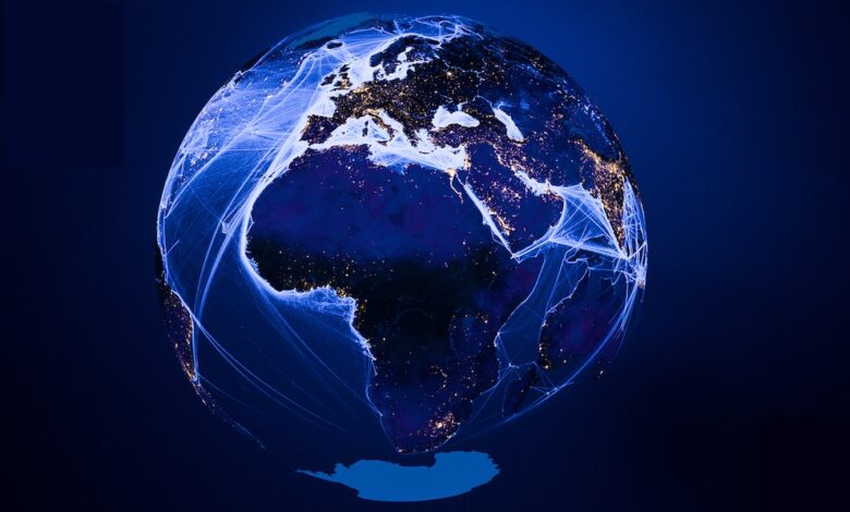
The intricate visualisation leverages open-access comprehensive ship movement data at a 500 m resolution sourced from the International Monetary Fund’s World Seaborne Trade Monitoring System. Combined with NASA’s Black Marble satellite night light imagery, it provides a detailed snapshot of global maritime logistics clearly showing where the world’s hotspots for shipping traffic are (see video below).
Distinctive for its design approach, the visualisation features transparent oceans and seas, offering a view that encompasses the opposite side of the globe.
“This innovative and experimental perspective challenges conventional maritime mapping methods and expands the horizon of global shipping patterns,” Hoffmann Anton told Splash.
The seaborne trades project was created as part of the #30DayMapChallenge, an initiative encouraging exploration and innovation in the field of cartography.
“The utilisation of open-source data and software in this project underscores the growing significance and utility of these resources in digital cartography, data analysis and communication. The creativity and pleasant aesthetics aims to make complex insights accessible to the wider public and experts at the same time,” Hoffmann Anton said.
Check out more of his distinctive, data-driven artwork including a Tokyo Eat Map, which represents the density of restaurants in central Tokyo on a map, morphed into a typical Japanese ramen dish, or his unique take on French wine, all available by clicking here.